The Power (and the Pitfalls) of One-Word Billboards
One-word billboards are having a moment. Brands like Lemonade have proven that a single word can stop traffic. Big type, no clutter, and a quick hit of meaning you can catch at 70 mph.
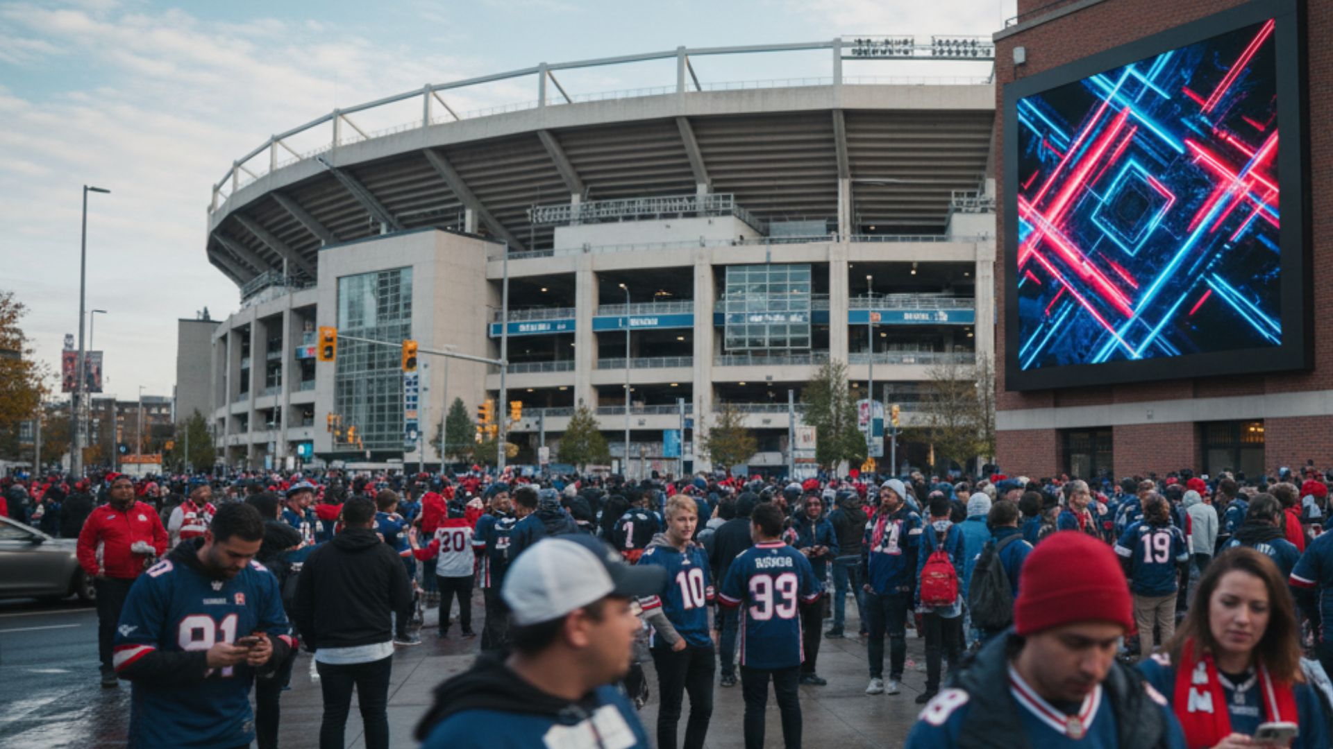
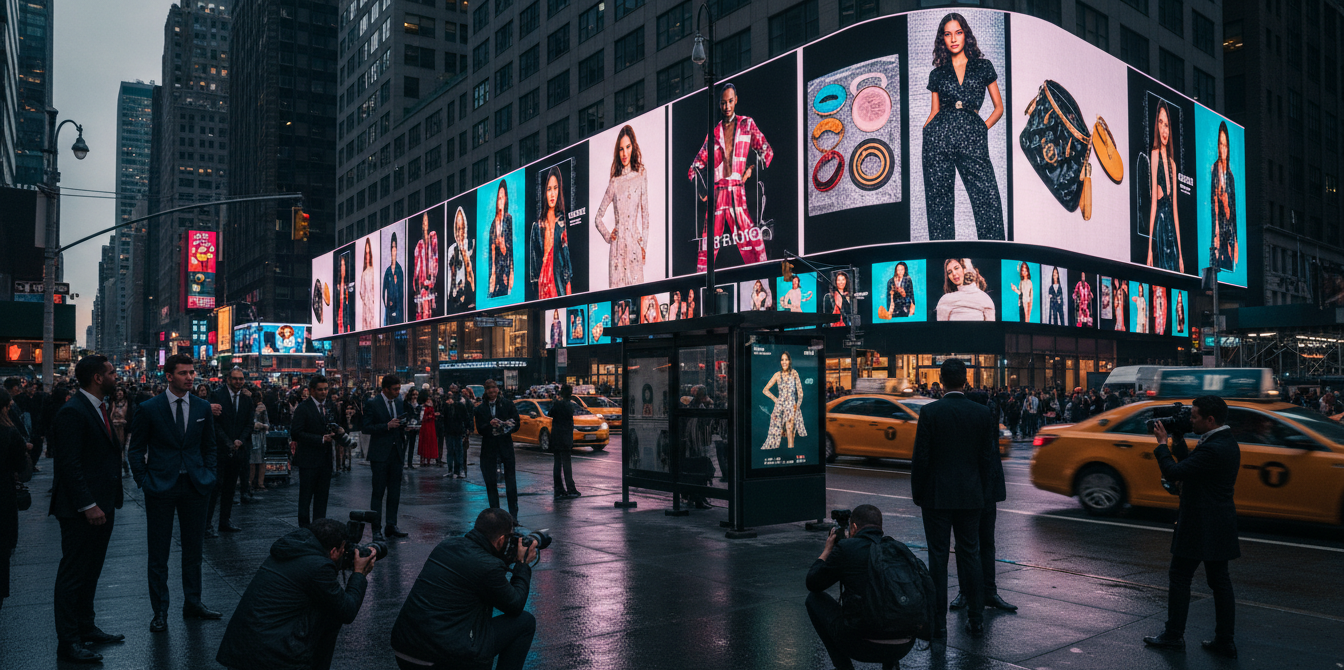
That simplicity is powerful. It creates instant recognition, makes production faster, and costs less to update. Digital billboards push this even further, using dynamic content and real-time scheduling to maximize every second of attention.
But minimalism isn’t magic. One word only works when your brand is already familiar or when the creative gives enough context for people to “get it.” Without that, it’s just a pretty poster with nothing to say.
Why One Word Works
- Clarity and speed: In a world of split-second attention spans, one word can do the work of ten.
- Brand recall: With fewer distractions, viewers remember what matters.
- Efficiency: Short copy means faster creative approval, smaller budgets, and easier swaps between flights.
Still, it’s a creative gamble, and every great minimalist campaign hides careful planning beneath the surface.
Pairing Minimalism With Context
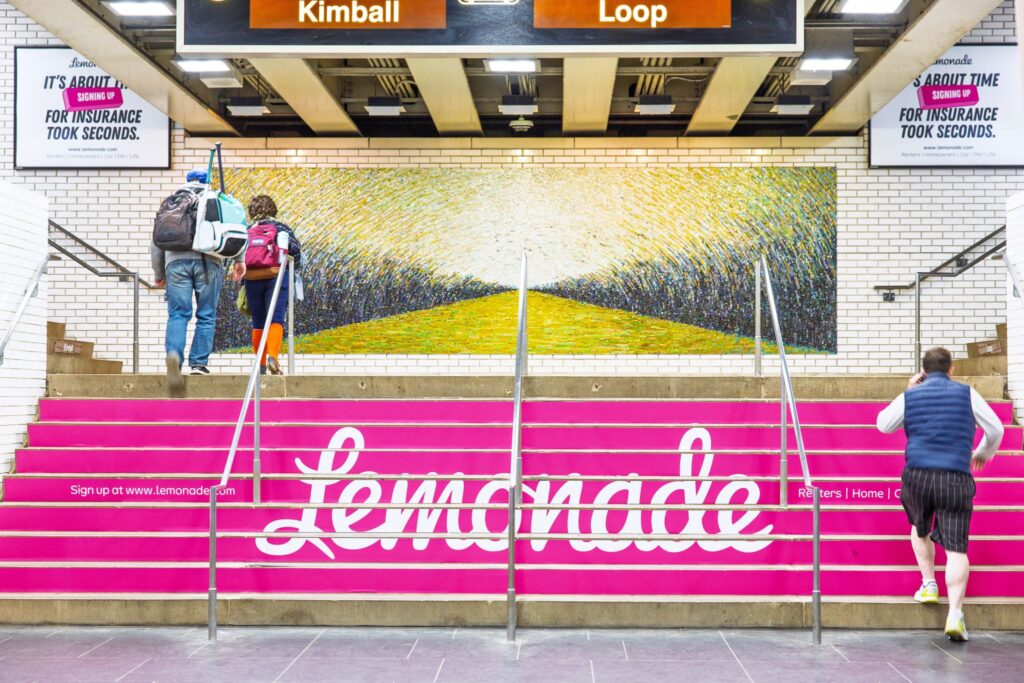
The smartest brands don’t leave their one-word ads hanging alone. They build context around them, nearby billboards, social posts, or digital retargeting that complete the story.
That’s exactly what Lemonade did. The single-word billboard drew eyes; the surrounding placements gave meaning. This omnichannel thinking turns a minimalist ad into a brand ecosystem where each format amplifies the other.
Design Matters: Font as a Visual Tool
Typography can turn a word into an experience. A stretch, a curve, or a letter twist can make copy feel like a logo. Think of how a unique typeface or color choice can carry emotion before anyone reads the word itself.
In DOOH, where space and motion are limited, type is your visual. Strong design transforms minimal copy into memorable creative.
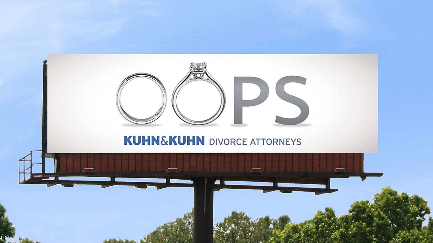
When The Logo Isn’t Enough
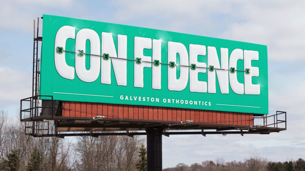
Similarly, sometimes, the simple formula of “Visual + Headline” doesn’t always have to apply to your specific creative. In fact, sometimes the visual and the headline don’t have to be separate at all. Check out this example from an orthodontist, of all places.
A logo alone isn’t a headline. Without context or curiosity, it fades into the background noise of city life. Even iconic brands like Nike or McDonald’s pair their logos with a punchy line that reinforces what they stand for.
For brands still building awareness, one bold statement does more heavy lifting than any symbol ever could.
Numbers to Know
- Headline length: 5–9 word headlines earn the most engagement (Nielsen Norman Group).
- Click-through rate: 8-word headlines see a 21 % lift in CTR versus shorter or longer ones (Outbrain).
- Logo size: Balanced branding boosts purchase intent by 20 %, while oversized logos risk annoyance (Kantar).
- Short copy: Concise, meaningful text increases recall by 30 % (MMA).
Minimalism can’t replace meaning. The best DOOH creative combines simplicity with strategy, a word that fits the moment, a font that tells the story, and placement that makes it impossible to ignore.
Takeaway
One-word billboards prove that less can be more, when done right. They work best when anchored by context, supported by other channels, and designed with purpose.
In DOOH, simplicity is powerful, but clarity wins. Want your next campaign to stick? Pair bold minimalism with smart strategy, and turn a single word into a full conversation.