Mastering Contextual DOOH: Strategies for Captivating Advertising
Picture this: A red billboard against a sunset with an enticing slogan that captures your curiosity. Now, let’s make this billboard yours! How do we achieve that? Read on as we embark on this creative journey together. Understanding the Target Audience
In today’s dynamic advertising space, expertise in OOH advertising is essential for creating effective outdoor advertisements. Understanding industry trends and innovations helps ensure your message stands out and reaches the right audience.
To create a compelling billboard, understanding your target audience is key. Let’s journey back to the iconic “Got Milk?” campaign. Remember those celebrity faces sporting milk mustaches? Those billboards didn’t just appear out of nowhere.
They were the product of understanding the target audience – people of all ages, who were skipping on their daily calcium intake. The campaign turned around the decreasing milk consumption trend and became a pop culture phenomenon, all because they knew who they were talking to.
Researching Audience Demographics and Preferences
Understanding your audience requires taking an important initial step, which is demographic and preference research. Companies utilize a variety of techniques to do this, from data analytics tools like Google Analytics to online survey platforms like SurveyMonkey, which may provide insights into website visitors’ behavior and preferences.
Social media sites may potentially be information gold mines. For example, Facebook Insights provides a plethora of information on your followers, such as their age, gender, geography, and which posts they engage with the most. In addition, third party data from external providers—such as geolocation and mobile data—can further enhance your understanding of audience demographics and preferences, enabling more targeted advertising and deeper customer insights. This gives you a better grasp of your audience’s tastes, likes and dislikes, and what connects with them and what doesn’t.
Identifying Key Messaging and Design Preferences
Once you’ve gathered information about your audience, it’s time to distill this data into key messaging and design preferences. Ask yourself: What problems does my audience face? What solutions can my product or service offer?. For instance, if you’re advertising a fitness app to young professionals, the key message could revolve around “staying fit despite a busy schedule.” The design preferences of this audience might lean towards minimalistic, clean designs, potentially with a monochromatic color scheme. It’s also crucial to ensure consistent messaging across all billboard designs to reinforce brand coherence and make your campaign more effective.
A billboard isn’t just a massive poster; it’s a dialogue between your brand and your audience. The clearer you are on who’s on the other side of that conversation, the more captivating your billboard will be. Up next, we’ll be talking about colors and fonts, another essential ingredient in the recipe for an eye-catching billboard! Stay tuned!
Choosing Colors and Fonts
Colors and fonts can make or break your billboard design. A tale that proves this point is that of the FedEx logo. It’s no coincidence that FedEx uses two strong, contrasting colors: purple and orange. Purple represents the promise of fast delivery (early morning or overnight), and orange represents less time-sensitive shipments (during the day). The font? A custom-made one that subtly incorporates a forward-pointing arrow between the “E” and “x,” indicating progress and efficiency.
Selecting Colors That Resonate with the Brand and Audience
Colors carry meanings and can provoke emotions. In billboard design, choosing the right colors is a way of non-verbally communicating your brand message. Blue can evoke feelings of trust, while red is known for drawing attention and creating urgency.
Understanding your brand and your audience’s perceptions of different colors can guide your color selection. For a children’s toy store, bright, vibrant colors would likely appeal to the audience. On the other hand, a high-end jewelry store may opt for black and gold to communicate luxury and elegance. Always remember, the colors you choose should not only resonate with your brand but also with your audience’s expectations and perceptions.
Choosing Fonts That Enhance Readability and Reinforce the Message
When it comes to fonts, readability is paramount, especially considering that billboards are often viewed from a distance and for just a few seconds. Opt for fonts that are clean, bold, and easy to read from afar.
Different fonts can also create different moods. Serif fonts, like Times New Roman, can give a traditional, trustworthy feel, while sans serif fonts, like Arial or Helvetica, often give a modern, clean look. Fancy scripts can feel elegant but might not be the best for readability. The FedEx example mentioned earlier perfectly illustrates how a simple, readable font can still be unique and tie into the overall brand message. With fonts, as with colors, the goal is to enhance your message, not detract from it. In the next section, we’ll dive into the world of graphics and imagery, and how they can turn your billboard from ‘meh’ to ‘marvelous’. Keep reading!
Incorporating Eye-Catching Graphics and Imagery
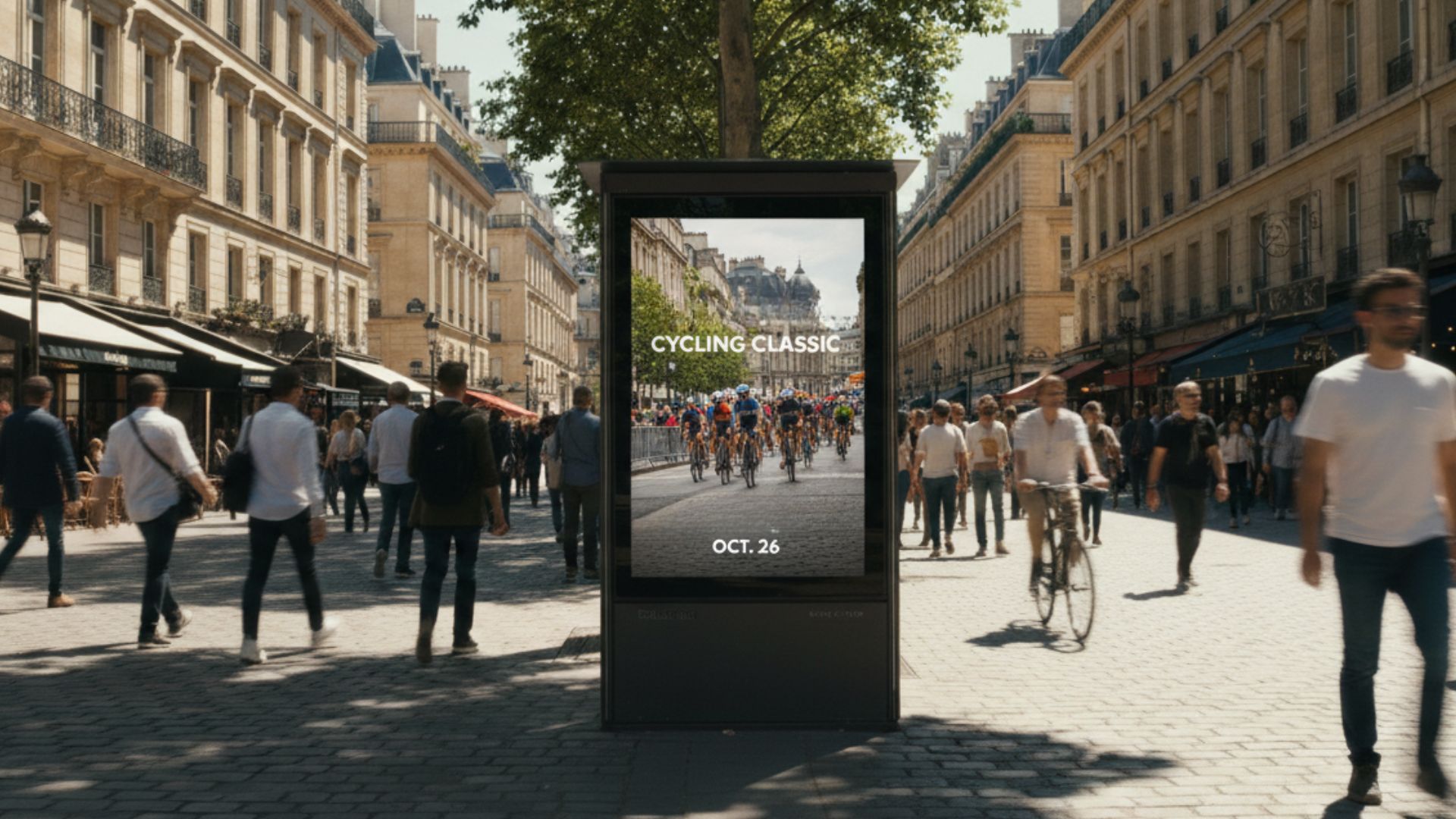
Who can forget the famous Coca-Cola Polar Bears? These fluffy, white bears captured hearts worldwide and served as a testament to the power of well-executed graphics and imagery. While static images, such as traditional posters and printed vinyl, have long played a key role in out-of-home advertising, modern billboard design increasingly leverages dynamic or interactive visuals to engage audiences. Imagery, when used right, can cut across language barriers and communicate your message universally.
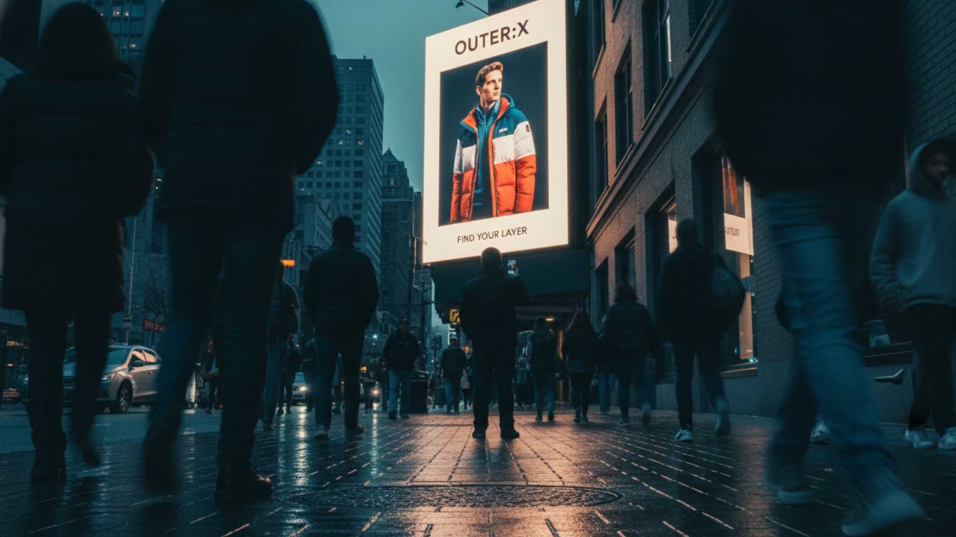
Using High-Quality Images That Align With the Message
The quality of your imagery can make a significant difference to the overall impact of your billboard design. High-resolution images that are clear and well-lit can create a more professional and appealing look. More than just aesthetics, the images you choose need to align with your brand message. For instance, if you’re advertising a travel company, images of exotic locations, happy travelers, or awe-inspiring landmarks would likely resonate well. Remember, the human brain processes images 60,000 times faster than text, so make sure the images you choose can speak for themselves!
Incorporating Visually Appealing Graphics and Illustrations
Much like images, your graphics and illustrations should align with your brand’s message and tone. If your brand is more serious or professional, a minimalist graphic could work well. For a more playful or creative brand, a vibrant, illustrated character might be the perfect choice. And let’s not forget the Coca-Cola Polar Bears – the right character can become an iconic part of your brand! Incorporating interactive elements, such as AR or trigger-based campaigns that respond to factors like weather or events, can further enhance engagement and creativity in billboard design. Next, we’ll explore how to make your brand stand out amidst the advertising noise with effective branding elements. Stay tuned!
Utilizing Branding Elements in Digital Out of Home
Have you ever seen a golden arch and immediately thought of McDonald’s? Or maybe the sight of a simple apple silhouette reminds you of Apple Inc.? That’s the power of branding at work. Implementing consistent branding elements across your billboard designs can ensure they’re easily recognizable and memorable. Effective branding elements not only boost brand recall but also create a lasting impression on viewers, making your message stick long after they’ve seen it.
Incorporating the Brand Logo and Consistent Visual Identity
Your brand logo is arguably the most critical element of your brand identity. When incorporated effectively into your billboard design, it can make your ad instantly recognizable, even from a distance. Take McDonald’s for instance – their golden arches are often the central element in their billboard designs, making them easily identifiable to passers-by. However, your brand’s visual identity extends beyond just your logo. It includes other elements like your color scheme, typography, and graphic style. Maintaining consistency in these elements across your billboards can help build a cohesive and strong brand image.
Ensuring Brand Recognition and Recall
The ultimate goal of incorporating branding elements in your billboard design is to achieve brand recognition and recall. In other words, you want your audience to recognize your brand immediately when they see your billboard and recall it later when they need your product or service. Coca-Cola’s red and white color scheme, or Apple’s minimalist design aesthetics, are great examples of this. Even without seeing their logos, you could probably identify their billboards due to their consistent and strong brand identities. Remember, every element of your billboard design, from colors to images, contributes to your overall brand image. Make sure they’re telling the story you want to be told. In the next section, we’ll discuss the importance of testing and refining your design. Because, like all good things, a great billboard design takes time, feedback, and lots of iterations. Keep reading!
Programmatic DOOH Advertising
Programmatic DOOH advertising is revolutionizing the way brands buy and deliver ads in public spaces. By using automated, data-driven technology, advertisers can seamlessly integrate DOOH into their broader advertising strategy, reaching a wide audience with minimal manual effort. Programmatic DOOH enables real-time auctions for ad space, allowing brands to bid on the most valuable placements and deliver dynamic content that adapts to audience demographics, time of day, or even local weather conditions.
This approach not only streamlines the process of buying DOOH inventory but also empowers advertisers to deliver highly relevant, engaging messages to their target audience. Whether you’re launching a new product or running a contextual campaign across multiple locations, programmatic DOOH ensures your advertising is agile, efficient, and impactful. By embracing programmatic technology, brands can optimize their DOOH campaigns for maximum reach and effectiveness, making every digital impression count.
Testing and Iterating
Have you ever heard of the “Darwinian Theory of Billboard Design”? Okay, it’s not an official term, but it should be. Like Darwin’s theory of evolution, the best billboard designs survive through a process of trial and error, testing, and refinement. Tracking digital impressions can help measure the effectiveness of billboard designs and guide further iterations.
Seeking Feedback and Conducting Tests
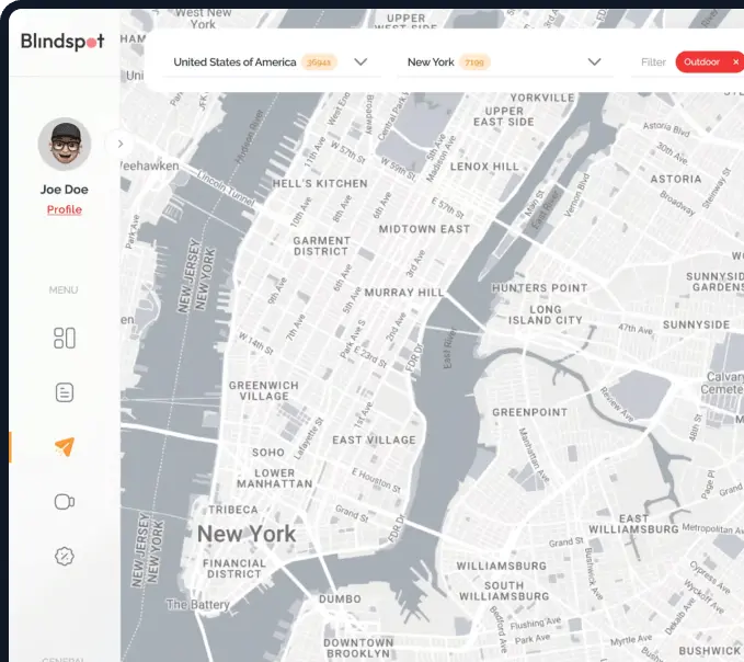
Once you’ve created a billboard design, it’s time to see how it resonates with your audience. This could involve informal feedback sessions with your team, conducting focus groups, or even utilizing online platforms like Blindspot, which allows you to test your digital billboard designs programmatically. Remember, you’re not just looking for what works but also what doesn’t. This could be anything from a font that’s difficult to read at a distance to an image that doesn’t align with your brand message. The goal is to find these potential issues and fix them before the design hits the billboard.
Iterating and Refining Design Based on Campaign Effectiveness Insights
Armed with the feedback, it’s time to go back to the drawing board and refine your design. Maybe you need to brighten your colors to make them more visible, or perhaps your key message needs to be more prominent. This is an iterative process, so don’t be afraid to make changes and retest your design. Remember, every iteration brings you closer to a design that not only captures attention but also perfectly communicates your brand message. In this journey of mastering billboard design, we’ve traveled from understanding our target audience to the final tweaks of the design. We hope these strategies will be helpful as you embark on your own creative journey. So, ready to paint the town red with your billboard? Let’s get started!
Measuring Campaign Effectiveness
Understanding the impact of your DOOH campaigns is essential for maximizing your advertising investment. With advanced data and analytics tools, advertisers can track key metrics such as reach, frequency, and engagement, providing a clear picture of campaign performance across this powerful advertising channel. Mobile location data adds another layer of insight, allowing brands to measure the effect of DOOH ads on foot traffic to retail locations and even link exposure to in-store sales.
By comparing DOOH campaign results with other advertising channels, marketers can make informed, data-driven decisions about where to allocate ad spend for the greatest return. Real-time reporting and optimization mean that campaigns can be adjusted on the fly, ensuring that your brand message is always reaching the right audience in the most effective way possible. With the ability to measure and refine campaign effectiveness, DOOH advertising stands out as a smart, results-driven choice for brands looking to engage audiences and drive real-world outcomes.